
Grit & Glam
Magazine Cover Idea
Lately, I have been having fun experimenting with designing magazine covers! I want to create a magazine that encourages women to be inspired by more than external beauty.
Inside the magazine will be articles like those on the front cover and glamorous yet gritty photography. There will always be one featured article interviewing a woman who will also be the cover model. This magazine will be unlike any other for women in that it shows how beautiful women can be on the outside and yet how gritty they are in ways that allow them to overcome real-life circumstances, which we all know are not necessarily easy to reveal and talk about. I want to interview women who are willing to showcase their vulnerabilities and show their beauty in a non-conventional way. A magazine like this could help women live more fulfilling lives but also help them be more collaborative and less judgemental of each other. It might allow them to feel more comfortable being competitive with each other in a more friendly way. It could help women understand the level of impact they could have on a fellow female’s life if they were willing to tell their stories and disclose their hardships along with their successes.
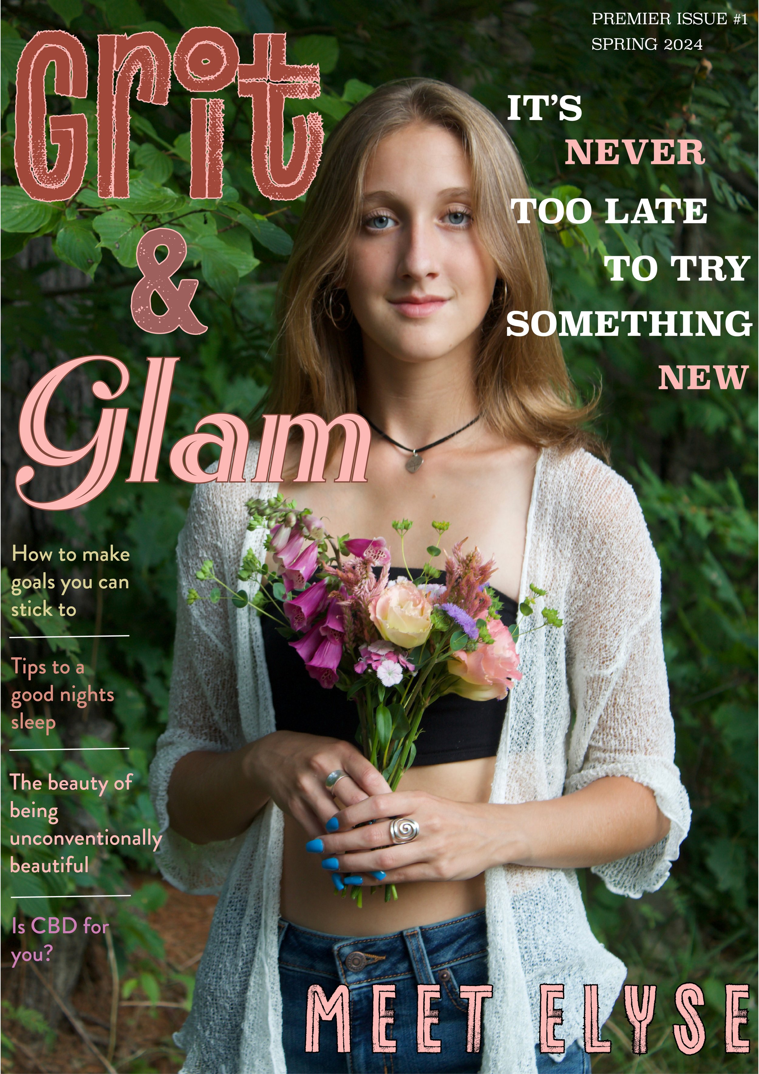
I wanted to create a design for the magazine cover that grabbed the attention of women passing by it on a newsstand. I hoped to find a typeface that really spoke to the feeling of the magazine. The word “Grit” needed to look rough and edgy. The word “Glam” needed to look, well, glamorous! Below are all the details about the typefaces I used. Initially, I would use white for all the words on the cover. However, after experimenting, I chose some colors from the bouquet for the letters to create a more fun and eye-catching look.
The cover photo is one that I took of Elyse during her outdoor senior photo shoot. I am proud of this photo because it was taken in natural light and did not need any filters or enhancers. This photo is totally original and exactly how I saw her in the natural light. It was taken during the Golden Hour (one hour before sunset) on a hot August evening in Maine.
I designed the magazine cover using my favorite Adobe App, InDesign.
Note: It is expensive to start a magazine and publish it; therefore, I would plan to do this in a digital form.
Typeface and Fonts used:
The word Grit is a typeface by Adobe Fonts called Canvas Inline (heavy)
The word Glam is a typeface by Adobe Fonts called Rhythm (one)
Article titles is a typeface by Adobe Fonts called Brandon Grotesque (medium)
The highlighted article title is in a typeface by Adobe Fonts called Superclarendon (bold)
The date and issue number on the top right are also in Superclarendon (I used all caps and a light font)