
Lucky Paws Logo Design.
My goal for this project was to design a logo that reflects Lucky Paws’ friendly, casual, and enthusiastic tone, appealing to animal lovers and pet owners. I wanted to create a logo that stood out from its competitors by highlighting its pet care/sitting services for various animals.
The Mood Board
After creating a client brief, I created a mood board to make sure we were both on the same page regarding the brand's colors and personality. I chose to show different types of animals/pets on the mood board to ensure she knew I understood that her pet-sitting service included a wide range of animals.
The Style Board
I created a style board that included the colors on the mood board, some typography styles that we may use for her logo and future marketing media, and a button style you may interact with on her future website. I also included some possible textures you might see or feel in her business and some adjectives and nouns that matched her brand. Additionally, I included her unique selling point, which is a critical piece of what separates her pet-sitting business from others.
The goal is to design a logo that remains recognizable even when it is resized.
While I like to let the client decide what they would like for their logo, I almost always have a suggestion ready in case they ask. In the case of Lucky Paws, I explained to the client that we would want something recognizable when scaled way down. To give this context, I tell my client to picture the logo embroidered on something, like on a shirt pocket or a hat. Can we still recognize it, or do the stitches overlap and make it look like a blob? I believe some of the logos I created below would lose their recognition in the embroidery test.
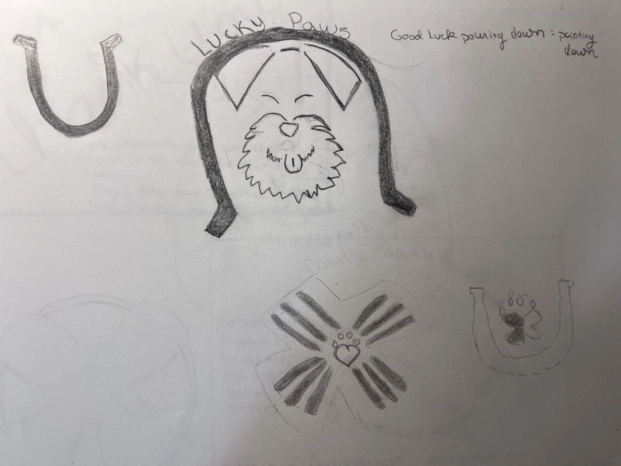
Logo possibilities
I first created these four possible logos shown above for Lucky Paws based on the business owner's vision. At first, she specifically said she did not want a clover in the design, but she wanted a horseshoe. She also said she wanted a schnauzer and a cat in the logo. After creating these four options for her, she seemed to prefer the one with just the paw inside the horseshoe. But she said there was something about it that wasn’t quite right. She couldn’t decide and asked me to disregard everything she had told me initially and get creative. That is how I came to create her new official logo, which includes a horseshoe and pawprint in the shape of a heart inside of a four-leaf clover. (see below)
Below is what I came up with, which has become her official logo design for Lucky Paws Pet Sitting Services.
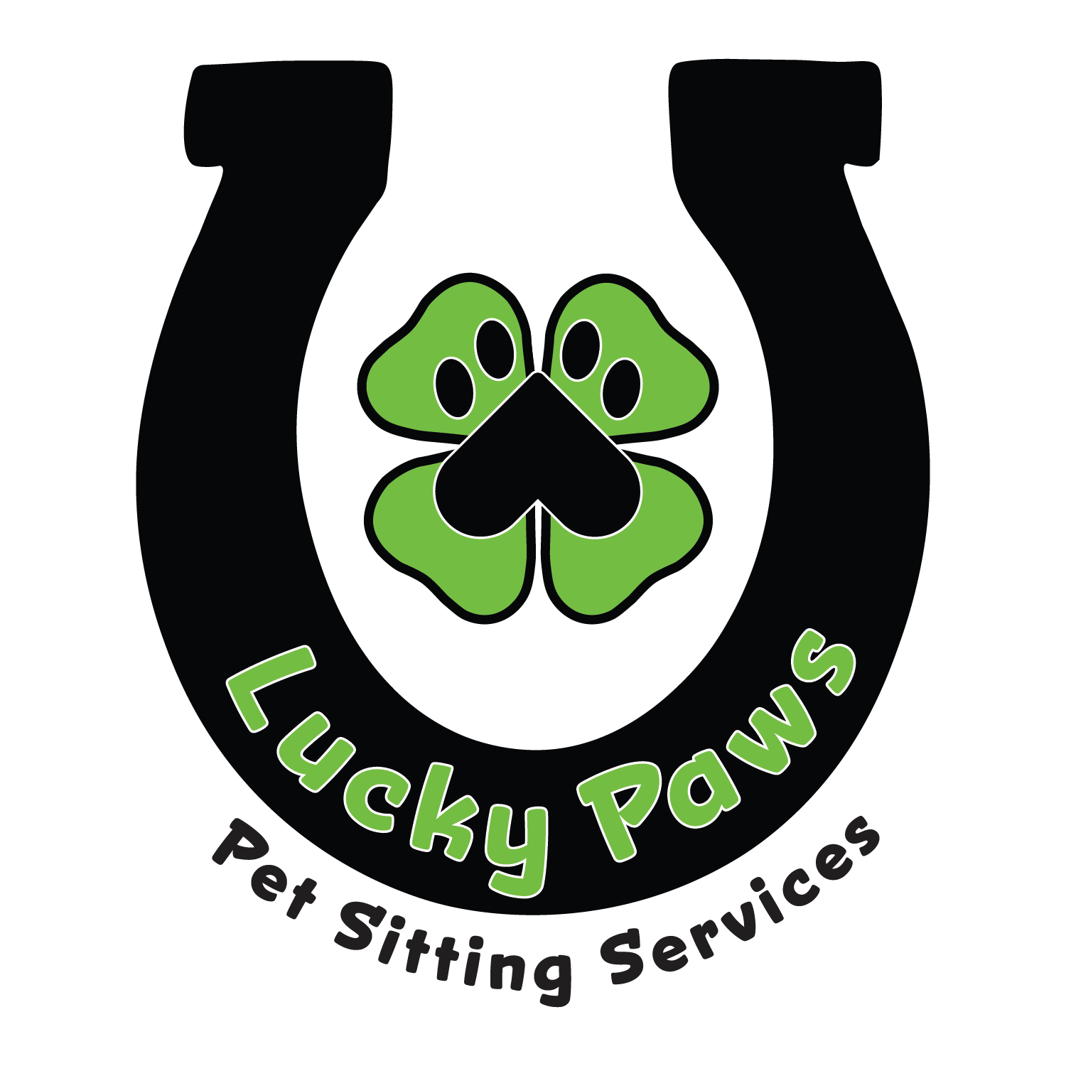
Lucky Paws logo with name of company and the service they provide.
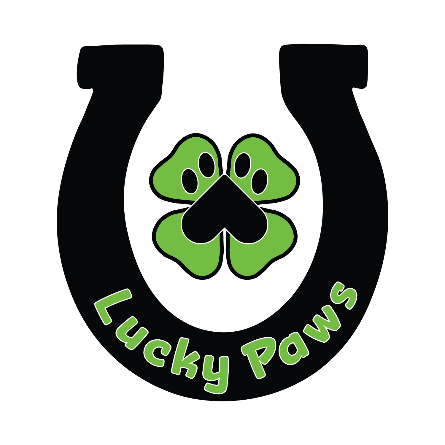
Lucky Paws logo with just the company name
Lucky Paws official logo/brand mark only

Lucky Paws logo type in black

Lucky Paws logo type in green